
Fall Family Photo Outfits
The weather is finally cooling off, leaves are changing color and falling to the ground, and all things cozy are in high demand. Fall is a beautiful time for family photos and a popular one at that. But perhaps one of your first questions is, “What should we wear?” There are a few unique aspects to dressing for family photos in the fall and I wanted to give you some examples and ideas in the hopes of making your outfit selection easier. As always, if you need additional help, I offer personalized outfit styling for all of my clients, so don’t hesitate to reach out!
Warm Neutrals

This family went with a rust, dusty pink, gray and tan color palette with a hint of light blue. I absolutely love this color palette. They also wore dark jeans which I find very flattering and a good contrast with the light colored grass. Each family member has nice brown shoes, and long sleeves to keep them warm on this cool fall morning.
Why it works?
It takes inspiration from the oranges and browns of the fall leaves, but puts a more muted twist on those colors for a very pleasing to the eye look. The colors look very flattering on all of the family members and no two family members are wearing exactly the same color or shade which means there is some contrast in every photos, no matter which family members are paired together. I also love the blending of patters in the girls’ dress and skirt as well as the variety of textures in their sweaters.
Shop the look: Girls shoes | Similar Girls dress | Similar girls sweater | Mom’s Sweater | Dad’s Sweater
2. Cool Contrast

This family used a base of cream, gray and brown neutrals with pops of color in sage and blue. Sage and blue are both cooler colors, which you might not immediately think about for fall, but they are great for complimenting the yellows, oranges and reds that you often find in fall leaves.
Why it works?
The colors in their outfits contrast very well with the background so that they stand out. Their outfits are coordinated well in that they look nice together, but aren’t matchy matchy. Their outfits are comfortable for a cool fall morning, but also look nice and are dressier than casual clothes.
Shop this look: Boy’s waffle knit sweater | similar girls corduroy skirt | Similar girls dress
3. Classy Neutrals

You really can’t go wrong wearing neutrals for your photos. Neutral colors that I recommend are grays, tans, browns, and creams. As much as possible I recommend limiting pure white and pure black as they can be difficult to photograph, and sometimes make the subject appear washed out or blend in the background too much. I also recommend choosing a variety of light and dark neutrals so that you have some contrast among your family members and help to stand out from the background.
Why it works
Neutrals can be very flattering in photos because they aren’t overpowering. They help you be the stand out subject, not your clothes, and they also help you to blend well with whatever may be in the background. When using neutrals, though, I recommend keeping the background in mind so that you don’t blend in too much with the background and still create some contrast between the background and your outfits.
Shop this look: Mom’s Dress | Overalls
4. Blues and Browns

Shop the look: similar boys’ vest | similar women’s plaid blazer | mens brown shoes

Shop the look: Girls pom pom sweaters | Mom’s Sweater | Similar heels
Both of the below photos use a pairing of dark blue, brown and tan. These colors work very well in both examples even though the backgrounds are very different. I love how in the more urban background picture, the background is very neutral and the brown and warmth of their outfits help to clue you in that the season is fall. In the picture on the right with the river, I love how the brown and cream in their outfits contrasts so well with the blue of the water and coordinates with the river rock.
Why it works?
Browns and tans work very well for fall because they are a warm neutral. Blue is a complimentary color to orange so it contrasts well with the oranges and browns that you find in most fall landscapes. These families went with a dark blue, but light blue works well with fall colors too.
5. Dark Rose and Dusty Blue

Shop the look: Mom’s Dress (similar) | Girl’s Similar Dress | Women’s similar dress

Shop the look: Similar Mom’s Dress | Similar girl’s dress
In the below pictures, these families paired mostly a combination of dusty blue and dark coral or dark rose. I love this combination and though it isn’t what I would have immediately thought of for fall colors, it works so well!
Why it works?
I believe blue and red contrast well together because they are close to complimentary (opposite each other on the color wheel) and they marry warm and cool colors. Combined with a yellow or tan background the three colors make up a triadic combination (colors that are equal distances from each other) on the color wheel which is considered a very visually appealing combination.
6. Classy Black and Tan
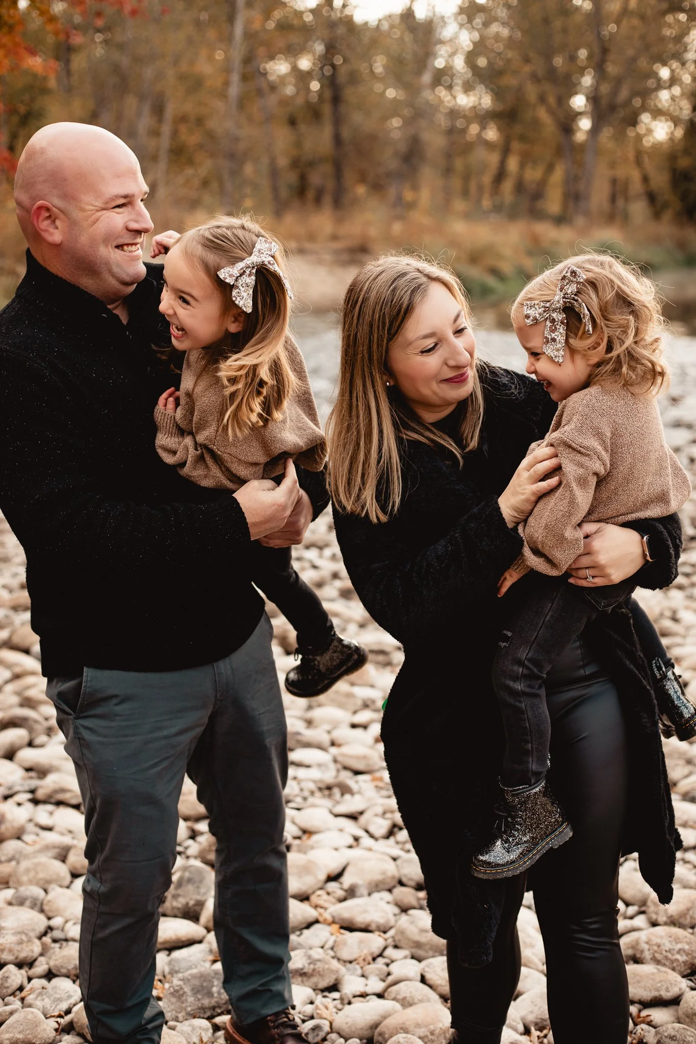
Shop this look: girls’ boots | similar girl’s bows | similar girl’s sweater

Shop this look: similar girls’ dress | similar womens’ dress
Black is arguably the classiest color one could wear, but it can be a risky choice for family photos. In photographs, black can loose detail fast which you can see in the first photo example. In these two examples, however I think it works very well and here’s why:
Why it works?
The first thing I would highlight about this color choice is that it works because the backgrounds are light. I wouldn’t choose black as a dominant color if the background was going to be darker (for example dark green trees). I also think it works because they didn’t have every single family member wear black. Rather, they broke it up with a lighter color, in this case tan which helps bring warmth and an overall fall feel to the photos.
7. Triadic Colors

What color typically makes us think of fall? Orange, right? We think of orange leaves, orange pumpkins and orange fire. Orange makes us think of being warm and cozy which is how we want to feel in the fall right? Well the color combination in the photo below takes orange and marries it with two colors that are equally distant from each other on the color wheel; green and purple.
Why it works?
This color scheme marries harmony and high contrast. The family also chose more muted tones of these colors so as not to stand out too much from the background. I also love the pairing of pattern in her skirt with the plaid on the little boy as well as a tiny bit of pattern or texture in dads shirt.
Shop this look: mom’s skirt | similar toddler flannel | similar men’s shirt
Read more like this


